1 Linear Regression 실습
import pandas as pd
import numpy as np
import matplotlib.pyplot as plt


np.random.seed(2021)
1.1 1. Univariate Regression
1.1.1 1.1 Sample Data
강의에서 예시로 사용했던 데이터를 생성합니다.
X = np.array([1,2,3,4])
y = np.array([2,1,4,3])
Plot으로 그려보겠습니다.
plt.scatter(X, y)
1.1.2 1.2 Data 변환
scikit-learn 에서 모델 학습을 위한 데이터는 (n,c) 형태로 되어 있어야 합니다.
- n은 데이터의 개수를 의미합니다.
- c는 feature의 개수를 의미합니다.
우리가 사용하는 데이터는 4개의 데이터와 1개의 feature로 이루어져 있습니다.

1.1.3 1.3 Liner Regression
from sklearn.linear_model import LinearRegressionLinearRgression 을 model변수에 선언합니다.
model = LinearRegression()
1.1.3 1.3.1 학습하기
scikii-learn 패키지의 LinearRegression을 이용해 선형 회귀 모델을 생성해 보겠습니다.
model을 학습은 fit함수를 이용해서 할 수 있습니다.
model.fit(X=..., y=...)X는 학습에 사용할 데이터를 y는 학습에 사용할 정답입니다.
model.fit(X=data, y=y)
model.fit(data, y)
1.1.3.2 1.3.2 모델의 식 확인
bias, 편향을 먼저 확인하겠습니다.
sklearn 에서는 intercept_로 확인할 수 있습니다.
model.intercept_
>> 1.0000000000000004
다음은 회귀계수 입니다.
coef_로 확인할 수 있습니다.
model.coef_
>> array([0.6])
위의 두 결과로 다음과 같은 회귀선을 얻을 수 있습니다.
y = 1.0000000000000004 + 0.6 * x
1.1.3.3 1.3.3 예측하기
이제 학습된 모델로 예측하는 방법에 대해서 알아보겠습니다.
모델의 예측은 predict 함수를 통해 할 수 있습니다.
model.predict(X=...)X는 예측하고자 하는 데이터입니다.
pred = model.predict(data)예측한 결과는 다음과 같습니다.
pred
>> array([1.6, 2.2, 2.8, 3.4])
1.1.4 1.4 회귀선을 Plot으로 표현하기
plt.scatter(X, y)
plt.plot(X, pred, color='green')

1.2 2. Multivariate Regression
1.2.1 2.1 Sample Data
Multivariate Regression에서 사용할 데이터를 생성하고 학습된 회귀식과 비교해 보겠습니다.
bias = 1
beta = np.array([2,3,4,5]).reshape(4, 1)
noise = np.random.randn(100, 1)
X = np.random.randn(100, 4)
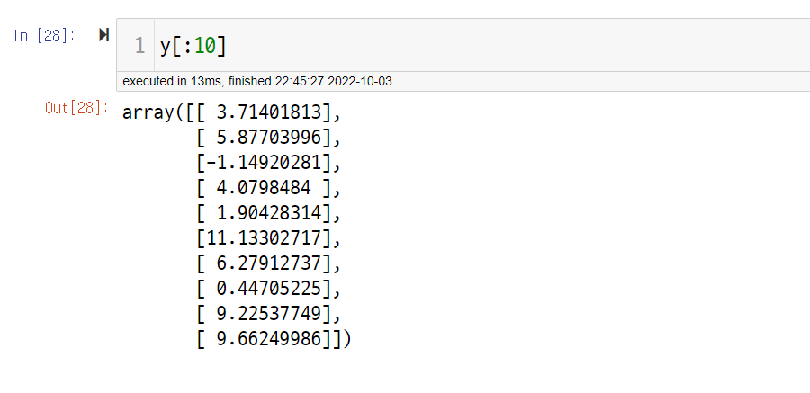
y = bias + X.dot(beta)
y_with_noise = y + noise

1.2.2 2.2 Multivariate Regression
model = LinearRegression()
model.fit(X, y_with_noise)
1.2.3 2.3 회귀식 확인하기
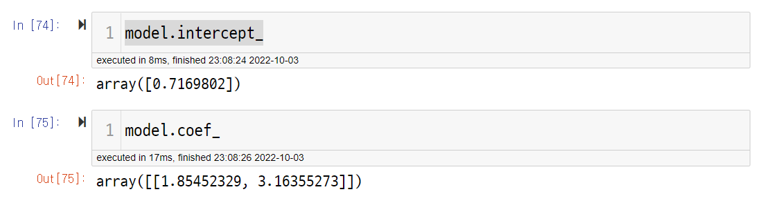
model.intercept_
>>> array([1.11417641])
model.coef_
>>> array([[1.99383579, 2.94374717, 3.97346537, 4.84223742]])
원래 식과 비교한 결과 편향은 잘 맞추지 못했습니다.
다만 회귀 계수의 경우 비교적 정확하게 예측을 하였습니다.
1.2.4 2.4 통계적 방법
이번엔 통계적 방법으로 회귀식을 계산해 보겠습니다.
bias_X = np.array([1]*len(X)).reshape(-1, 1)
stat_X = np.hstack([bias_X, X])
X_X_transpose = stat_X.transpose().dot(stat_X)
X_X_transpose_inverse = np.linalg.inv(X_X_transpose)

stat_beta = X_X_transpose_inverse.dot(stat_X.transpose()).dot(y_with_noise)

stat_beta

>>> array([[1.11417641],
       [1.99383579],
       [2.94374717],
       [3.97346537],
       [4.84223742]])
1.3 3. Polynomial Regression
1.3.1 3.1 Sample Data
비선형 데이터를 생성해 보겠습니다.
bias = 1
beta = np.array([2,3]).reshape(2, 1)
noise = np.random.randn(100, 1)

X = np.random.randn(100, 1)
X_poly = np.hstack([X, X**2])
X_poly[:10]
>>> array([[-0.82837807, 0.68621022],
[ 0.37173043, 0.13818351],
[-0.06235794, 0.00388851],
[ 0.51317671, 0.26335034],
[ 0.83678172, 0.70020365],
[-0.31516016, 0.09932592],
[ 0.54850903, 0.30086215],
[-0.20530578, 0.04215046],
[-0.55608089, 0.30922596],
[ 0.16189434, 0.02620978]])
y = bias + X_poly.dot(beta)
y_with_noise = y + noise
plt.scatter(X, y_with_noise)
1.3.2 3.2 Polynomial Regression
1.3.2.1 3.2.1 학습하기
model = LinearRegression()
model.fit(X_poly, y_with_noise)
1.3.2.2 3.2.2 회귀식 확인하기
1.3.2.3 3.2.3 예측하기
pred = model.predict(X_poly)
1.3.3 3.3 예측값을 Plot으로 확인하기
- 비선형으로 예측하는 것을 확인할 수 있습니다.
plt.scatter(X, pred)
'Machine Learning > 머신러닝 온라인 강의' 카테고리의 다른 글
| CH02_06. 당뇨병 진행도 예측 (Python) (0) | 2022.10.05 |
|---|---|
| CH02-05. Regularization (1) | 2022.10.03 |
| CH02-02. Linear Regression 심화 (0) | 2022.10.03 |
| CH02-01. Linear Regression (0) | 2022.10.03 |
| CH01-02. Model Selection (1) | 2022.10.03 |


