캐글 : https://www.kaggle.com/c/bike-sharing-demand
Bike Sharing Demand | Kaggle
www.kaggle.com
# 2011년에 세워진 자전거 스타트업.
# 2011년부터 성장을 거듭함 (count가 성장하는 추세임)
import pandas as pd
import numpy as np
import matplotlib as mpl
import matplotlib.pyplot as plt
import seaborn as sns

# 노트북 안에 그래프를 그리기 위해
%matplotlib inline

# 그래프에서 격자로 숫자 범위가 눈에 잘 띄도록 ggplot 스타일 사용
plt.style.use('ggplot')

# 그래프에서 마이너스 폰트 깨지는 문제에 대한 대처
mpl.rcParams['axes.unicode_minus'] = False

import warnings
warnings.filterwarnings('ignore')
Description
- datetime - hourly date + timestamp
- season - 1 = spring, 2 = summer, 3 = fall, 4 = winter
- holiday - whether the day is considered a holiday
- workingday - whether the day is neither a weekend nor holiday
- weather 1: Clear, Few clouds, Partly cloudy, Partly cloudy 2: Mist + Cloudy, Mist + Broken clouds, Mist + Few clouds, Mist 3: Light Snow, Light Rain + Thunderstorm + Scattered clouds, Light Rain + Scattered clouds 4: Heavy Rain + Ice Pallets + Thunderstorm + Mist, Snow + Fog
- temp - temperature in Celsius
- atemp - "feels like" temperature in Celsius
- humidity - relative humidity
- windspeed - wind speed
- casual - number of non-registered user rentals initiated
- registered - number of registered user rentals initiated
- count - number of total rentals
train = pd.read_csv("data_bike/train.csv", parse_dates=['datetime'])

print(train.shape)
train.head(25)
>>>
(10886, 12)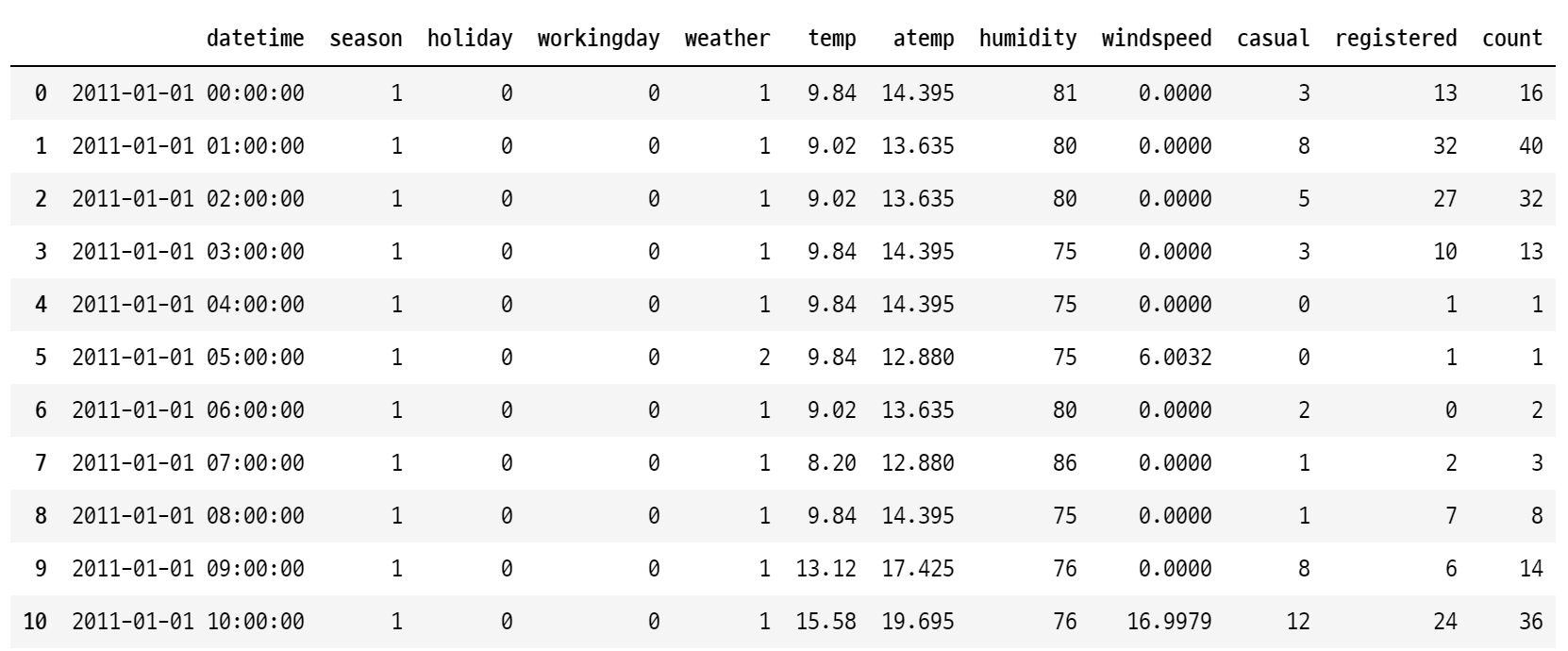
train.info()

>>>
<class 'pandas.core.frame.DataFrame'>
RangeIndex: 10886 entries, 0 to 10885
Data columns (total 12 columns):
 #   Column      Non-Null Count  Dtype
---  ------      --------------  -----
 0   datetime    10886 non-null  datetime64[ns]
 1   season      10886 non-null  int64
 2   holiday     10886 non-null  int64
 3   workingday  10886 non-null  int64
 4   weather     10886 non-null  int64
 5   temp        10886 non-null  float64
 6   atemp       10886 non-null  float64
 7   humidity    10886 non-null  int64
 8   windspeed   10886 non-null  float64
 9   casual      10886 non-null  int64
 10  registered  10886 non-null  int64
 11  count       10886 non-null  int64
dtypes: datetime64[ns](1), float64(3), int64(8)
memory usage: 1020.7 KB
# null인 데이터 확인
train.isnull().sum()

>>>
datetime      0
season        0
holiday       0
workingday    0
weather       0
temp          0
atemp         0
humidity      0
windspeed     0
dtype: int64
test = pd.read_csv('data_bike/test.csv', parse_dates=['datetime'])

print(test.shape)
test.head()

>>> (6493, 9)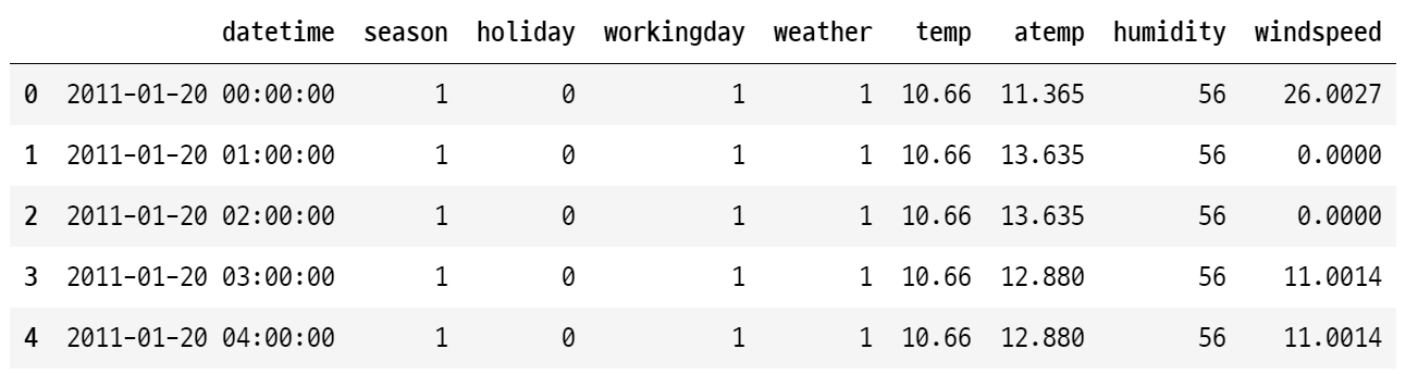
Categorical = ['season', 'holiday', 'workingday', 'weather']

for col in Categorical:
    train[col] = train[col].astype('category')
    test[col] = test[col].astype('category')

# 카테고리로 데이터 타입을 바꿀 수 있다. 문자 Object에 대한 타입을 카테고리로 변경


train.info()

>>>
<class 'pandas.core.frame.DataFrame'>
RangeIndex: 10886 entries, 0 to 10885
Data columns (total 12 columns):
 #   Column      Non-Null Count  Dtype
---  ------      --------------  -----
 0   datetime    10886 non-null  datetime64[ns]
 1   season      10886 non-null  category
 2   holiday     10886 non-null  category
 3   workingday  10886 non-null  category
 4   weather     10886 non-null  category
 5   temp        10886 non-null  float64
 6   atemp       10886 non-null  float64
 7   humidity    10886 non-null  int64
 8   windspeed   10886 non-null  float64
 9   casual      10886 non-null  int64
 10  registered  10886 non-null  int64
 11  count       10886 non-null  int64
dtypes: category(4), datetime64[ns](1), float64(3), int64(4)
memory usage: 723.7 KB
train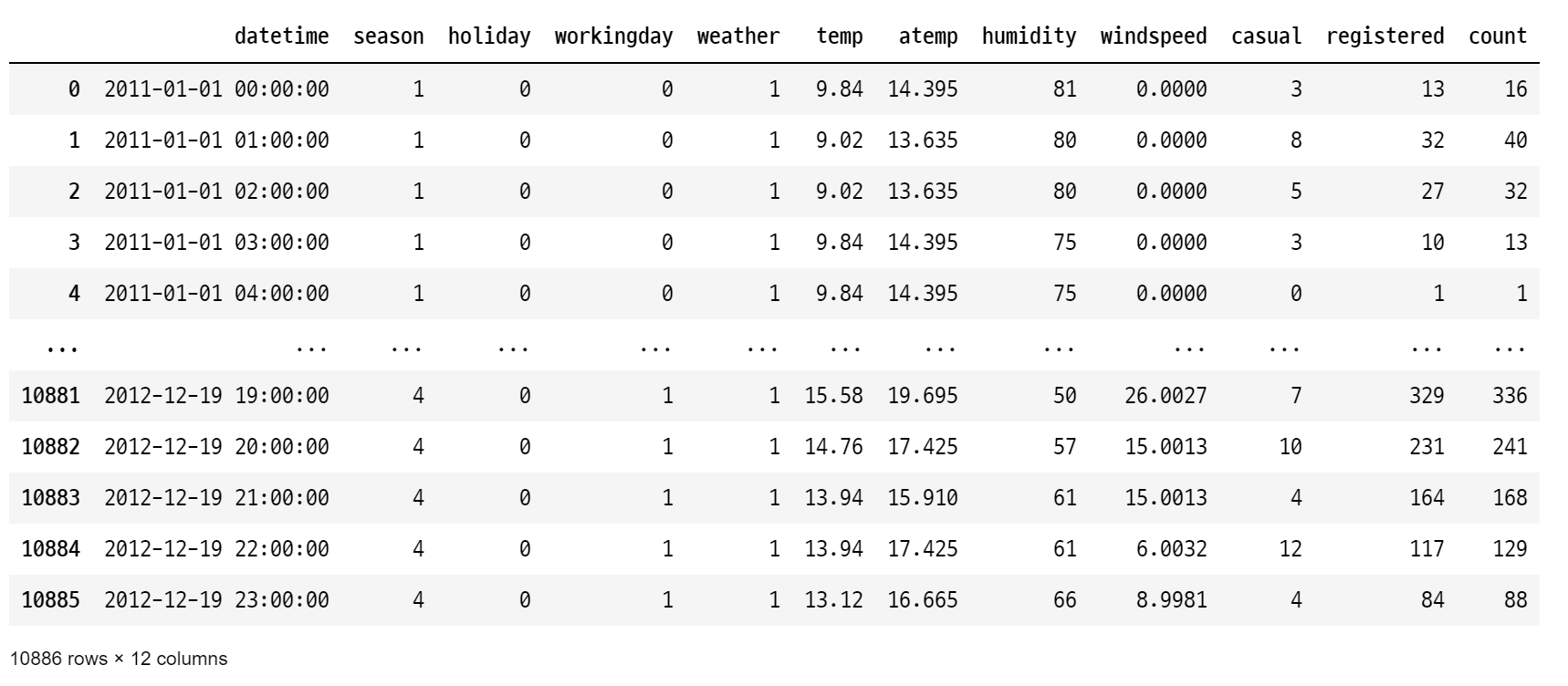
train['datetime'].dt.second

# datetime의 초를 불러오자. 시간단위가 기준이라 hour로 봐야한다.

>>>
0        0
1        0
2        0
3        0
4        0
        ..
10881    0
10882    0
10883    0
10884    0
10885    0
Name: datetime, Length: 10886, dtype: int64


train['datetime'].dt.hour

>>>
0         0
1         1
2         2
3         3
4         4
         ..
10881    19
10882    20
10883    21
10884    22
10885    23
Name: datetime, Length: 10886, dtype: int64
# '년월일시분초' -> '년/월/일/시/분/초/요일'로 열 추가
train['year'] = train['datetime'].dt.year # 년
train['month'] = train['datetime'].dt.month # 월
train['day'] = train['datetime'].dt.day # 일
train['hour'] = train['datetime'].dt.hour # 시
train['minute'] = train['datetime'].dt.minute # 분
train['second'] = train['datetime'].dt.second # 초
train['dayofweek'] = train['datetime'].dt.dayofweek # 요일
print(train.shape)
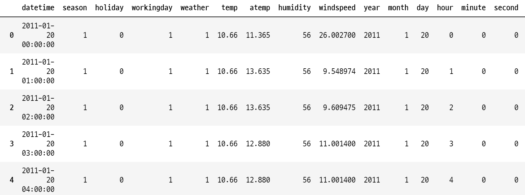
train.head(3)
>>> (10886, 19)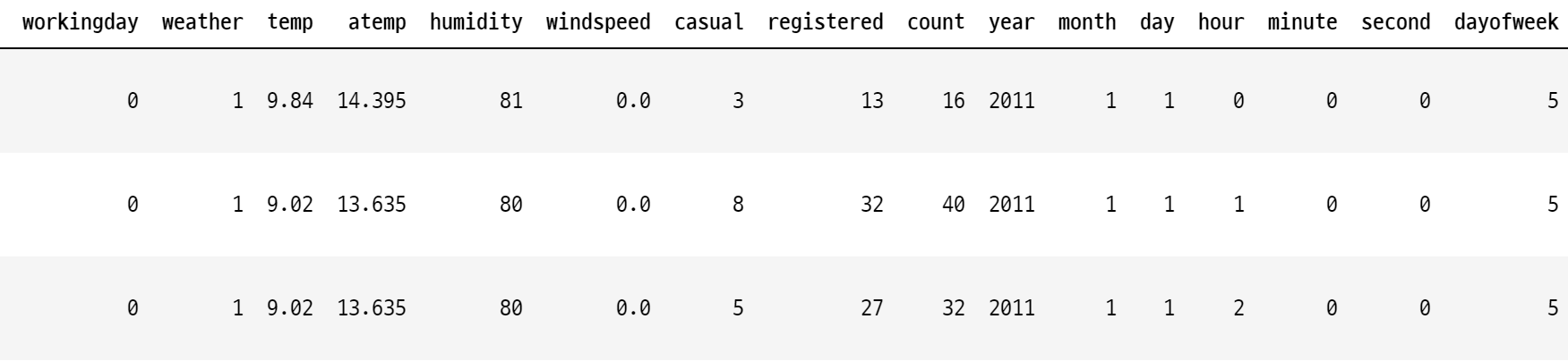
# '년월일시분초' -> '년/월/일/시/분/초'로 열 추가
test['year'] = test['datetime'].dt.year
test['month'] = test['datetime'].dt.month
test['day'] = test['datetime'].dt.day
test['hour'] = test['datetime'].dt.hour
test['minute'] = test['datetime'].dt.minute
test['second'] = test['datetime'].dt.second
test['dayofweek'] = test['datetime'].dt.dayofweek

print(test.shape)

>>> (6493, 16)
0.1 windspeed가 0값인 것들은 0아닌 값들로 예측해서 집어넣기
train['windspeed']

>>>
0         0.0000
1         0.0000
2         0.0000
3         0.0000
4         0.0000
          ...
10881    26.0027
10882    15.0013
10883    15.0013
10884     6.0032
10885     8.9981
Name: windspeed, Length: 10886, dtype: float64
# windspeed==0인 것, 0아닌 것 분리
train_wind_0 = train[train.windspeed==0]
print(train_wind_0.shape)

train_wind_not0 = train[train.windspeed!=0]
print(train_wind_not0.shape)

>>>
(1313, 19)
(9573, 19)
# windspeed가 0인 것들은 windspeed가 0이 아닌 것들로 예측해서 채워넣고 다시 데이터 합치기
feature_names_wnot0 = ['year','month','hour','season', 'weather', 'atemp', 'humidity']X_train = train_wind_not0[feature_names_wnot0]
y_train = train_wind_not0['windspeed']
from sklearn.ensemble import RandomForestRegressor
model = RandomForestRegressor()
model.fit(X_train, y_train)
X_test = train_wind_0[feature_names_wnot0]
X_test.shape
>>> (1313, 7)
train_wind_0['windspeed'] = model.predict(X_test)
train_wind_0[train_wind_0['windspeed']==0]
# windspeed==0인 것들은 없음
train = pd.concat([train_wind_0, train_wind_not0], axis=0).sort_values(by='datetime')
train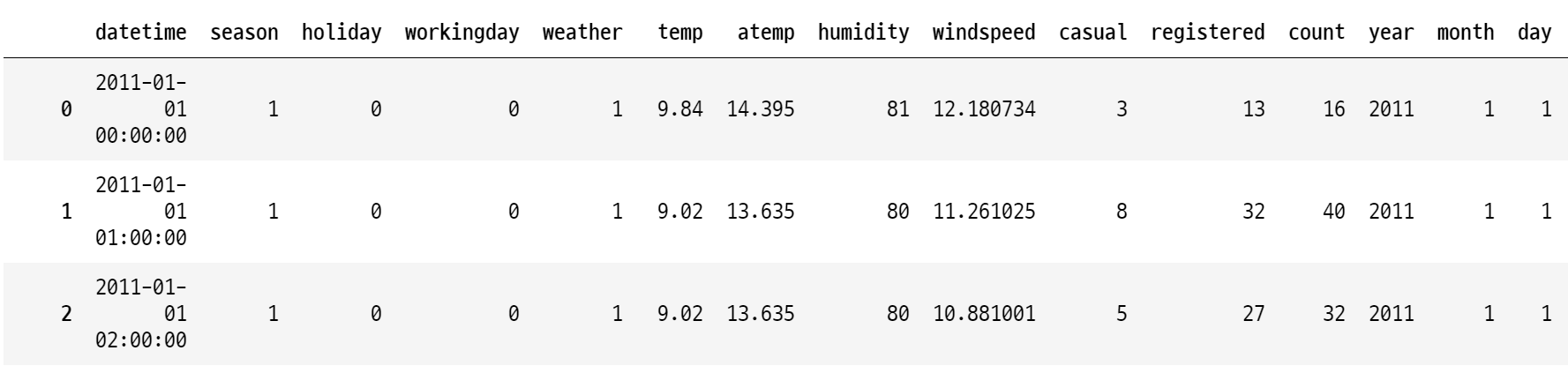
0.2 test 셋도 windspeed가 0인것 예측해서 집어넣기
# windspeed==0인 것, 0아닌 것 분리
test_wind_0 = test[test.windspeed==0]
print(test_wind_0.shape)

test_wind_not0 = test[test.windspeed!=0]
print(test_wind_not0.shape)

>>>
(867, 16)
(5626, 16)
X_test = test_wind_0[feature_names_wnot0]
test_wind_0['windspeed'] = model.predict(X_test)


test_wind_0[test_wind_0['windspeed']==0]
>>> # 아무것도 안나옴!


test = pd.concat([test_wind_0, test_wind_not0], axis=0).sort_values(by='datetime')
1 EDA
import matplotlib
import matplotlib.font_manager as fm

fm.get_fontconfig_fonts()
font_location = 'C:/Windows/Fonts/NGULIM.ttf' # For Windows
font_name = fm.FontProperties(fname=font_location).get_name()
matplotlib.rc('font', family=font_name)
# 그래프에서 마이너스 폰트 깨지는 문제에 대한 대처
from matplotlib import font_manager, rc
# 년월일시분초 barplot 그려보기
figure, ((ax1, ax2, ax3), (ax4, ax5, ax6)) = plt.subplots(nrows=2, ncols=3) # 테이블위치 ax1~ax6 지정
figure.set_size_inches(20,10)
sns.barplot(data=train, x='year', y='count', ax=ax1) # 년
sns.barplot(data=train, x='month', y='count', ax=ax2) # 월
sns.barplot(data=train, x='day', y='count', ax=ax3) # 일
sns.barplot(data=train, x='hour', y='count', ax=ax4) # 시
sns.barplot(data=train, x='minute', y='count', ax=ax5) # 분
sns.barplot(data=train, x='second', y='count', ax=ax6) # 초
ax1.set(ylabel='Count',title="연도별 대여량")
ax2.set(xlabel='month',title="월별 대여량")
ax3.set(xlabel='day', title="일별 대여량")
ax4.set(xlabel='hour', title="시간별 대여량")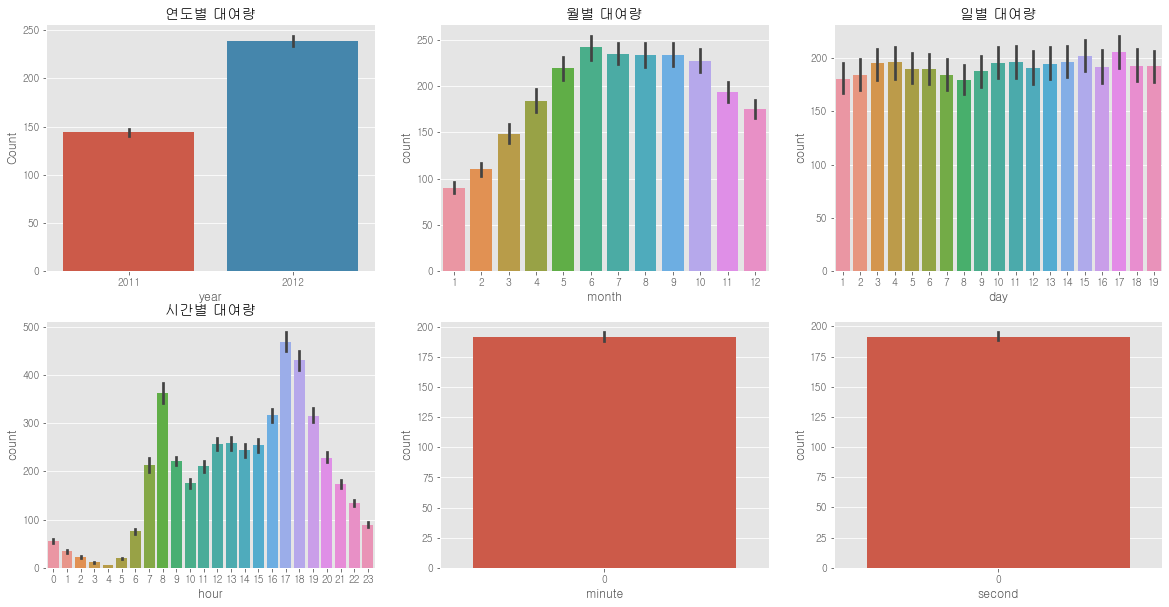
- 연도별 대여량은 2011년 보다 2012년이 더 많다.
- 월별 대여량은 6월에 가장 많고 7~10월도 대여량이 많다. 그리고 1월에 가장 적다.
- 일별대여량은 1일부터 19일까지만 있고 나머지 날짜는 test.csv에 있다. 그래서 이 데이터는 피처로 사용하면 안 된다.
- 시간 대 대여량을 보면 출퇴근 시간에 대여량이 많은 것 같다. 하지만 주말과 나누어 볼 필요가 있을 것 같다.
- 분, 초는 다 0이기 때문에 의미가 없다.
=> feature로 쓸만한게 year, month, hour (day, minute, second는 버림)
# 박스플랏 그려보자
figure, axis = plt.subplots(nrows=2, ncols=2)          # 테이블 위치 (2, 2) 지정
figure.set_size_inches(20, 10)
sns.boxplot(data=train, y='count', ax=axis[0][0])                     # 대여량 전체
sns.boxplot(data=train, y='count', x='season', ax=axis[0][1])
sns.boxplot(data=train, y='count', x='hour', ax=axis[1][0])
sns.boxplot(data=train, y='count', x='workingday', ax=axis[1][1])

# 라벨 달기
axis[0][0].set(ylabel='Count',title="대여량")
axis[0][1].set(xlabel='Season', ylabel='Count',title="계절별 대여량")
axis[1][0].set(xlabel='Hour Of The Day', ylabel='Count',title="시간별 대여량")
axis[1][1].set(xlabel='Working Day', ylabel='Count',title="근무일 여부에 따른 대여량")
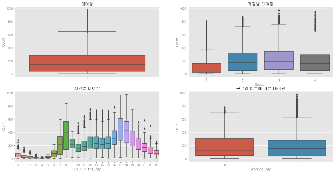
=> 봄, 겨울보다 여름이나 가을이 더 많이 자전거를 탄다.
=> 8시, 17시, 18시가 가장 많이 자전거를 탄다.
# 요일별 그래프 그려보기
plt.figure(figsize=(15,6))
sns.barplot(data=train, x='dayofweek', y='count')
# => 요일은 큰 의미 없어보이는데...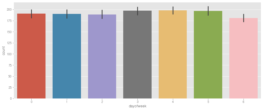
1.1 휴일, 요일, 날씨, 계절 별 - 시간 그래프
figure, (ax1, ax2, ax3, ax4, ax5) = plt.subplots(nrows=5)
figure.set_size_inches(20, 30)
sns.pointplot(data=train, x='hour', y='count', ax=ax1)
sns.pointplot(data=train, x='hour', y='count', hue='workingday', ax=ax2)
sns.pointplot(data=train, x='hour', y='count', hue='dayofweek', ax=ax3)
sns.pointplot(data=train, x='hour', y='count', hue='weather', ax=ax4)
sns.pointplot(data=train, x='hour', y='count', hue='season', ax=ax5)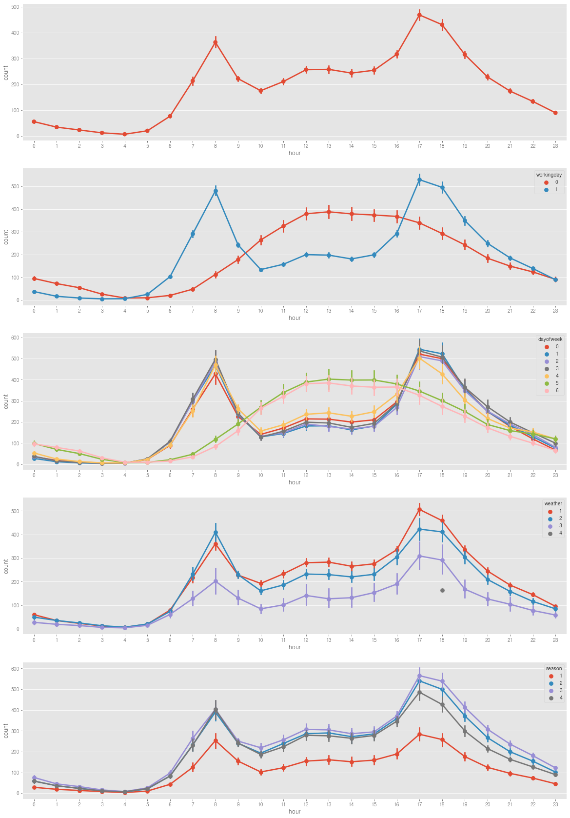
sns.jointplot(data=train, x='temp', y='count')
sns.jointplot(data=train, x='windspeed', y='count')
sns.jointplot(data=train, x='humidity', y='count')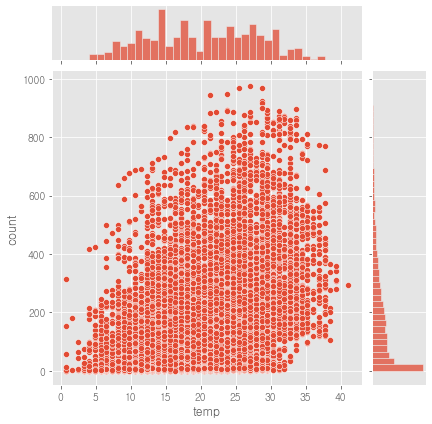
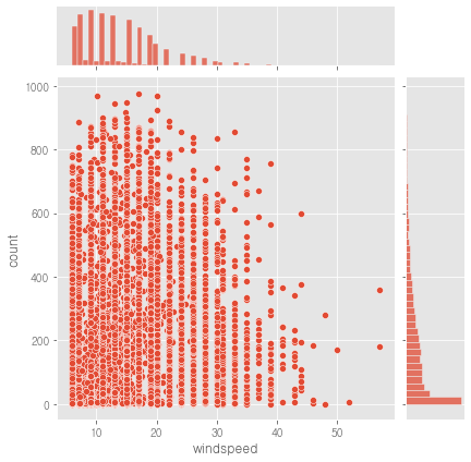
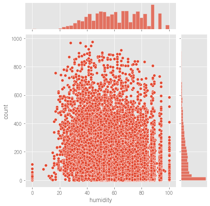
count와
- temp는 양의 상관관계가 있어 보임
- windspeed는 음의 상관관계가 있어 보임
- humidity는 음의 상관관계가 있어 보임
1.1.1 pairplot으로 그리면 한번에 그려줘서 편함
train.columns.unique()

>>>
Index(['datetime', 'season', 'holiday', 'workingday', 'weather', 'temp',
       'atemp', 'humidity', 'windspeed', 'casual', 'registered', 'count',
       'year', 'month', 'day', 'hour', 'minute', 'second', 'dayofweek'],
      dtype='object')
sns.pairplot(train[['temp', 'atemp', 'humidity', 'windspeed', 'casual', 'registered', 'count']])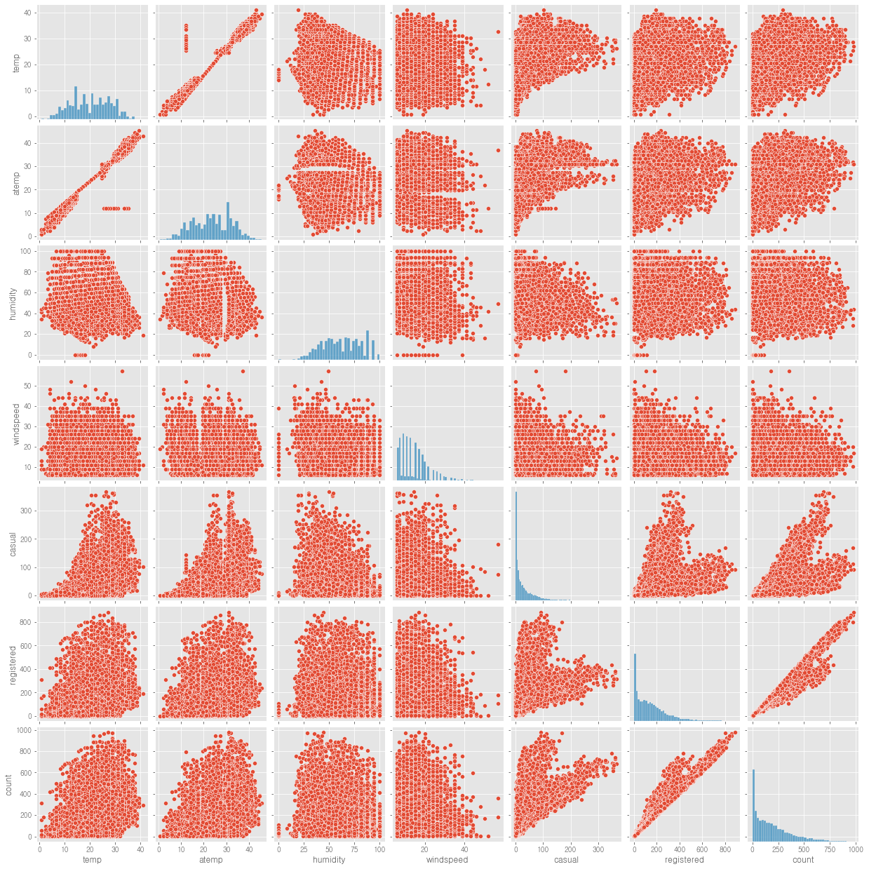
# 히트맵도 한번 그려보자
fig=plt.gcf()
fig.set_size_inches(20,10)
sns.heatmap(train.corr(), cmap='RdBu_r', square=True, cbar=True, annot=True, fmt=".2f")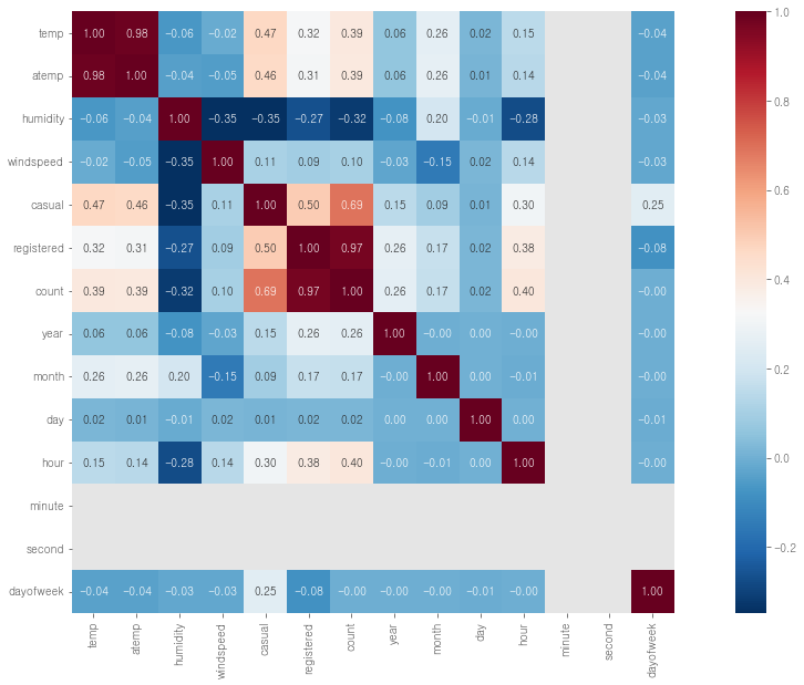
=> 날씨, 시간 등이 count에 영향을 미친다
1.2 년월을 이어서 그래프 그리기
# 2011년~2012년 year와 month를 합쳐서 그래프를 그려보자
# datetime을 넣으면 년월 형식으로 변환해주는 함수
def year_month(datetime):
    return str(datetime.year)+"-"+str(datetime.month)

train['year_month'] = train['datetime'].apply(year_month)
train[['datetime', 'year_month']].head()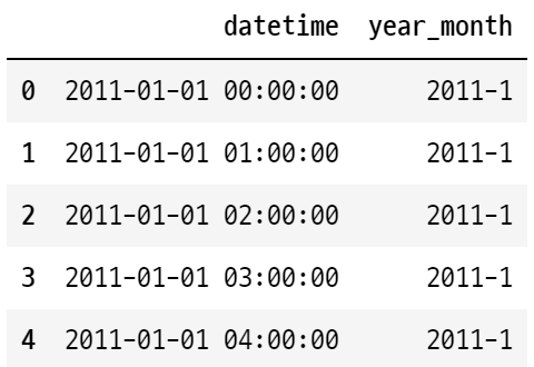
test['year_month'] = test['datetime'].apply(year_month)

figure, (ax1, ax2) = plt.subplots(nrows=1, ncols=2)
figure.set_size_inches(20,5)
sns.barplot(data=train, x='year', y='count', ax=ax1)
sns.barplot(data=train, x='month', y='count', ax=ax2)

figure, ax3 = plt.subplots(nrows=1, ncols=1)
figure.set_size_inches(20,5)
sns.barplot(data=train, x='year_month', y='count', ax=ax3)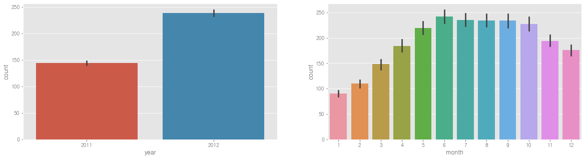
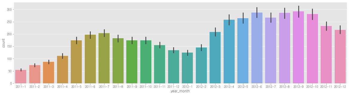
- 기업 성장세로 점점 증가하는 것 -> 연도_월 합쳐서 feature로 사용해야 할듯
1.3 종속변수인 'count'가 right-skew되어있다.(정규분포 아니다) -> 이상적인 예측모델은 아니다.
# 정규화 해주기
train['log_count'] = np.log(train['count'] + 1)
sns.distplot(train['count'])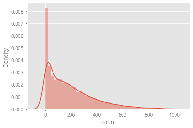
figure, (ax1, ax2) = plt.subplots(nrows=1, ncols=2)
figure.set_size_inches(18,4)

sns.distplot(train['count'], ax=ax1)
sns.distplot(train['log_count'], ax=ax2)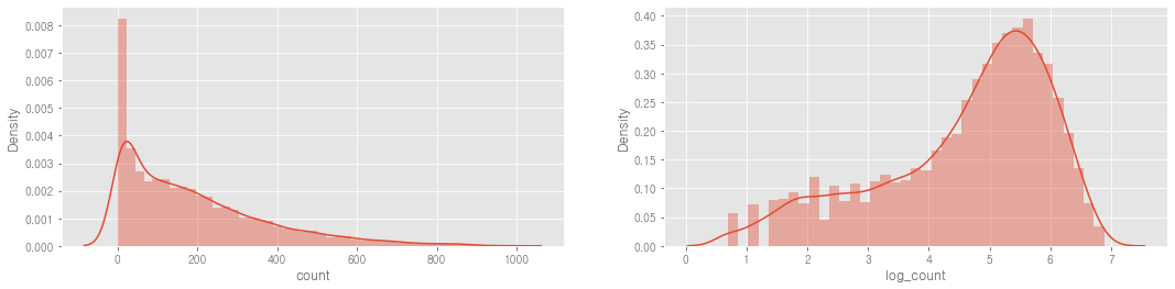
train['count_recover'] = np.exp(train['log_count']) - 1
train[['count', 'log_count', 'count_recover']].head()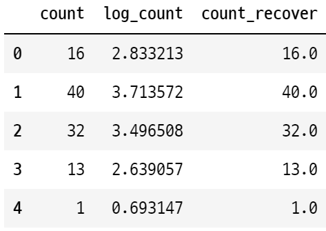
2 => EDA 종료
'Machine Learning > 머신러닝 완벽가이드 for Python' 카테고리의 다른 글
| ch6. 차원 축소 (0) | 2022.10.20 |
|---|---|
| 예제 1-2. bike-sharing-demand_랜덤포레스트회귀 (0) | 2022.10.13 |
| ch 5.7_로지스틱 회귀_ 5.8_회귀 트리 (실습) (0) | 2022.10.13 |
| ch.5.8 회귀 트리 (0) | 2022.10.13 |
| ch.5.7 로지스틱 회귀 (0) | 2022.10.13 |


