스타벅스 이벤트 관련 고객 설문 데이터
- 스타벅스 고객들의 이벤트 관련 설문에 응답한 데이터의 일부이다.
- 해당 데이터에서 고객들이 이벤트에 대한 응답을 어떻게 하는지 찾고
- 고객 프로모션 개선방안에 대한 인사이트를 찾는다.
0. Data Description
1. Profile table
profile 데이터는 설문에 참여한 스타벅스 회원에 관련된 정보가 담겨 있다.
"Dimesional data about each person, including their age, salary, and gender.
There is one unique customer for each record."
2. transcript
이벤트에 참여한 실제 유저들의 응답이 기록되어 있습니다.
"Records show the different steps of promotional offers that a customer received. The different values of receiving a promotion are receiving, viewing, and completing. You also see the different transactions that a person made in the time since he became a customer. With all records, you see the day that they interacted with Starbucks and the amount that it is worth."
3. portfoilo
이벤트를 운영했던 내역에 관한 정보가 담겨 있습니다.
"Information about the promotional offers that are possible to receive, and basic information about each one including the promotional type, duration of the promotion, reward, and how the promotion was distributed to customers."
1. 라이브러리 및 데이터 로드
- 분석에 필요한 데이터와, 라이브러리를 불러옵니다.
# 데이터 분석 필수 라이브러리 4종 세트 불러오기
import pandas as pd
import numpy as np
import matplotlib.pyplot as plt
import seaborn as sns
# Starbucks Customer Data 폴더안에 있는 데이터 3개를 불러오기
base_path = "폴더 경로"
ex) "C:/Users/JIN SEONG EUN/Desktop/빅데이터 분석가 과정/Part3. 파이썬 기초와 데이터분석/data/starbucks-customer-data/"

transcript = pd.read_csv(base_path + "transcript.csv")
profile = pd.read_csv(base_path + "profile.csv")
portfolio = pd.read_csv(base_path + "portfolio.csv")
transcript

# 판다스에서 read_csv 하면 기존 인덱스가 추가됨, 그래서 unnamed가 있음
# 제거하고 싶으면 .drop(columns=["Unnamed: 0"]) 나 .drop("Unnamed: 0", axis = 1) 사용
transcript = pd.read_csv(base_path + "transcript.csv").drop(columns=["Unnamed: 0"])
profile = pd.read_csv(base_path + "profile.csv").drop("Unnamed: 0", axis = 1)
portfolio = pd.read_csv(base_path + "portfolio.csv").drop(columns=["Unnamed: 0"])

transcript  # unnamed 컬럼 사라진거 확인

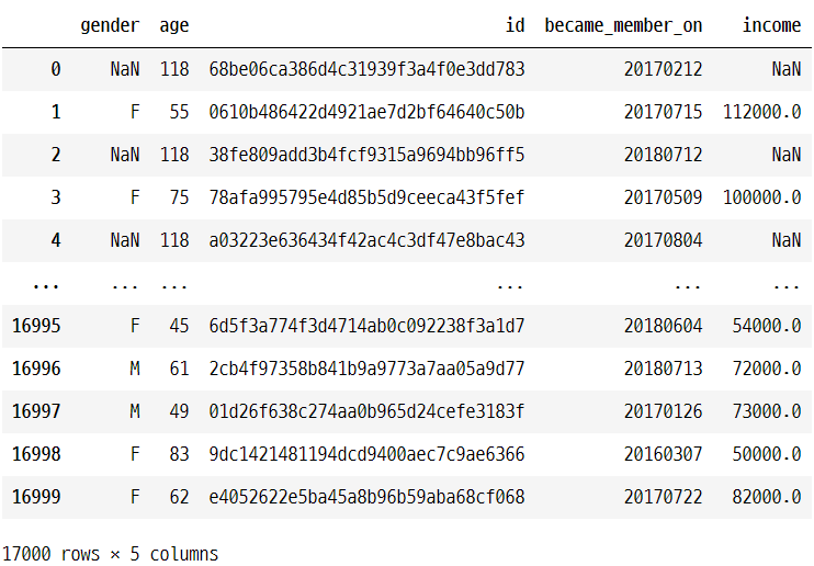
profile
portfolio

2. 데이터 전처리
- 결측치가 존재하는 데이터를 찾아서, 결측치를 처리해줍니다.
# 각 데이터에 결측치가 있는지 확인
transcript.info()
<class 'pandas.core.frame.DataFrame'>
RangeIndex: 306534 entries, 0 to 306533
Data columns (total 4 columns):
 #   Column  Non-Null Count   Dtype
---  ------  --------------   -----
 0   person  306534 non-null  object
 1   event   306534 non-null  object
 2   value   306534 non-null  object
 3   time    306534 non-null  int64
dtypes: int64(1), object(3)
memory usage: 9.4+ MB
portfolio.info()
<class 'pandas.core.frame.DataFrame'>
RangeIndex: 10 entries, 0 to 9
Data columns (total 6 columns):
 #   Column      Non-Null Count  Dtype
---  ------      --------------  -----
 0   reward      10 non-null     int64
 1   channels    10 non-null     object
 2   difficulty  10 non-null     int64
 3   duration    10 non-null     int64
 4   offer_type  10 non-null     object
 5   id          10 non-null     object
dtypes: int64(3), object(3)
memory usage: 608.0+ bytes
profile.info()
<class 'pandas.core.frame.DataFrame'>
RangeIndex: 17000 entries, 0 to 16999
Data columns (total 5 columns):
 #   Column            Non-Null Count  Dtype
---  ------            --------------  -----
 0   gender            14825 non-null  object
 1   age               17000 non-null  int64
 2   id                17000 non-null  object
 3   became_member_on  17000 non-null  int64
 4   income            14825 non-null  float64
dtypes: float64(1), int64(2), object(2)
memory usage: 664.2+ KB
# gender와 income이 null 값을 가짐을 확인할 수 있다.
# 17000 -14825 = 2175 null count
# 결측치를 포함하는 데이터들은 어떤 데이터들인지 확인
# .isnull( ) null --> 값 가진 데이터를 True로 표시한다
# profile.isnull().any(axis = 1) --> 한 row에 null값이 하나라도 있으면 True로 표시하라 (masking)
# profile[profile.isnull().any(axis = 1)]
profile.isnull()
profile.isnull().any(axis = 1)
profile[profile.isnull().any(axis = 1)]

# null 값을 없애보자!
# 새로 데이터 프레임 만듬
nulls = profile[profile.isnull().any(axis = 1)]
# nulls 안에 gender 요소의 수는?
nulls.gender.value_counts()
>>> Series([], Name: gender, dtype: int64)  --> 전부 null값이다
# nulls 안에 income 요소의 수는?
nulls.income.value_counts()
>>>  Series([], Name: income, dtype: int64)  --> 전부 null값이다
# nulls 안에 age 요소의 수는?
nulls.age.value_counts()
>>>	118    2175
    Name: age, dtype: int64
# 전부 118값이다 --> 이 데이터는 이미 이상한 데이터로 처리가 되었다.
# .nunique( ) 다른값을 가진 갯수를 보여줌
# nulls 안에 age가 가진 다른 값의 갯수는?
nulls.age.nunique()
>>> 1
# nulls 안에 id가 가진 다른 값의 갯수는?
nulls.id.nunique()
>>> 2175   --> 모든 값이 다르다!
# 결측치를 처리하자.
# 평균과 같은 통계량으로 채워주거나, 버리자.
# .dropna( ) null 값을 드롭
profile = profile.dropna( ) # .dropna() null 값을 드롭하는거 같음
profile.info() # null값이 없음을 확인!
<class 'pandas.core.frame.DataFrame'>
Int64Index: 14825 entries, 1 to 16999
Data columns (total 5 columns):
# Column Non-Null Count Dtype
--- ------ -------------- -----
0 gender 14825 non-null object
1 age 14825 non-null int64
2 id 14825 non-null object
3 became_member_on 14825 non-null int64
4 income 14825 non-null float64
dtypes: float64(1), int64(2), object(2)
memory usage: 694.9+ KB
3. profile 데이터 분석
- 설문에 참여한 사람 중, 정상적인 데이터로 판단된 데이터에 대한 분석을 수행하자
- 각 column마다 원하는 통계량을 찾은 뒤, 해당 통계량을 멋지게 시각화해 줄 plot을 seaborn에서 가져와 구현하자.
profile

# became_member_on의 정보가 int로 되어있다
# profile의 became_member_on 데이터를 시간 정보로 변환하자
# pd.to_datetime(profile.became_member_on.astype(str), format='%Y%m%d') 시간정보로 변환하는 함수
profile.became_member_on = pd.to_datetime(profile.became_member_on.astype(str), format='%Y%m%d')
profile

profile.info()
<class 'pandas.core.frame.DataFrame'>
Int64Index: 14825 entries, 1 to 16999
Data columns (total 5 columns):
 #   Column            Non-Null Count  Dtype
---  ------            --------------  -----
 0   gender            14825 non-null  object
 1   age               14825 non-null  int64
 2   id                14825 non-null  object
 3   became_member_on  14825 non-null  datetime64[ns]
 4   income            14825 non-null  float64
dtypes: datetime64[ns](1), float64(1), int64(1), object(2)
memory usage: 694.9+ KB
# datatime으로 타입변경되었다!
# 이제 분석을 해보자.
성별에 관한 분석
profile.gender.value_counts()M 8484
F 6129
O 212
Name: gender, dtype: int64
plt.figure(figsize=(8,6))
sns.countplot(data=profile, x = "gender", palette = "Set2")

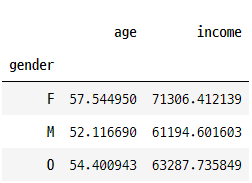
pd.pivot_table(data= profile, index="gender",values= "income")

나이에 대한 분석
- 나이는 countplot보다 hisplot으로 분석하는 것이 좋음
- 연령대가 얼마나 퍼져있는지 확인하는데 히스토그램이 도움이 된다!
plt.figure(figsize(8,6))
sns.hisplot(data = profile, x = "age", bins = 15, hue = gender, multiple = "stack"
plt.show()
# multiple = "stack" 겹치지 않고 쌓아서 보게 함

# 피벗 테이블 나이를 인덱스로 찍으면 복잡해진다.
pd.pivot_table(data= profile, index= "gender", values=["age","income"])
# 파이썬 컷함수 써서 연령대로 나누어 분석해볼 수 도 있음 해보자
# cut 함수에 대해 살펴보자
# cut 함수의 사용방법은 [데이터, 구간의 갯수, 레이블명] 에 해당하는 인자값을 지정해주는 것이다.
# labels를 지정하지 않으면 구간의 나눈 기준이 레이블명으로 지정된다.
profile["age_range"] = pd.cut(profile["age"],5,  labels = ["child","young adult","middle adult", "older adult", "senior"] )
profile["age_range"]
1        middle adult
3         older adult
5         older adult
8        middle adult
12       middle adult
             ...
16995     young adult
16996    middle adult
16997     young adult
16998     older adult
16999    middle adult
Name: age_range, Length: 14825, dtype: category
Categories (5, object): ['child' < 'young adult' < 'middle adult' < 'older adult' < 'senior']
profile

# age_range가 추가된 것을 확인할 수 있다.
profile.age_range.value_counts()
middle adult    5384
young adult     3800
older adult     2807
child           2256
senior           578
Name: age_range, dtype: int64
plt.figure(figsize=(8,6))
sns.countplot(data= profile, x = "age_range")

pd.pivot_table(data= profile, index="age_range", values=["gender","income"])

pd.pivot_table(data= profile, index= "gender", values=["age","income"])
회원이 된 날짜에 대한 분석
# profile["join_yr"] = profile.became_member_on.dt.year
# "join_yr"라는 열 추가
# dt.year 연도만 추출
# dt.mouth 월만 추출
profile["join_yr"] = profile.became_member_on.dt.year
profile["join_month"] = profile.became_member_on.dt.month
profile

# join year countplot
plt.figure(figsize=(8,6))
sns.countplot(data=profile, x = "join_yr",palette="Set2")
plt.show()

# join month countplot
plt.figure(figsize=(12,8))
sns.countplot(data=profile, y= "join_month")
plt.show()

# 정렬하기 위해서 value_counts로 정리후 barplot으로 만든다
x = profile.join_month.value_counts().index
y = profile.join_month.value_counts().values
plt.figure(figsize=(12,8))
sns.barplot(x=x, y=y, order=x)
plt.show()

수입에 대한 분석
plt.figure(figsize=(8,6))
sns.histplot(data= profile, y="income", palette="Set2", hue="gender",multiple= "stack")

profile 데이터에 대한 상관관계 분석
plt.figure(figsize=(8,6))
sns.heatmap(data=profile.corr(), square=True, annot=True)
plt.show()
# square는 셀을 정사각형으로 출력하는 것,
# annot은 셀 안에 숫자를 출력해주는 것,
# annot_kws는 그 숫자의 크기를 조정해줄 수 있는 파라미터이다.

4. transcript에 대한 분석
- 각 column마다 원하는 통계량을 찾은 뒤, 해당 통계량을 멋지게 시각화해 줄 plot을 seaborn에서 가져와 구현하자.
- person과 values column은 분석 대상에서 제외하자
transcript

event에 대한 분석
plt.figure(figsize=(8,6))
sns.countplot(data=transcript, x = "event",palette="Set2")

pd.pivot_table(data=transcript, index= "event", values = "time")

time에 대한 분석
transcript.time.value_counts().head(10)408 17030
576 17015
504 16822
336 16302
168 16150
0 15561
414 3583
510 3514
582 3484
588 3222
temp = sorted(transcript.time.value_counts()[ : 6].index)
# sorted 함수로 6번째 까지 인덱스까지 잘라서 정렬하자
print(temp)

for i in range(len(temp)-1):
    print(temp[i+1]-temp[i], end=" ")  # 168/24 = 7일
# 정렬된 요소들 간의 차이를 계산해보자
[0, 168, 336, 408, 504, 576]
168 168 72 96 72
# 168/24 = 7일
# temp의 차이는 무엇이냐?
# 일주일 마다 이벤트가 renew 되었다!plt.figure(figsize=(8,6))
sns.histplot(data=transcript, x="time")
plt.show()

temp_df = transcript.loc[transcript.time.isin(temp)]
# isin메서드는 DataFrame객체의 각 요소가 values값과 일치하는지 여부를 bool형식으로 반환한다.
temp_df.time.value_counts()
>>>>
    408    17030
    576    17015
    504    16822
    336    16302
    168    16150
    0      15561
    Name: time, dtype: int64

temp_df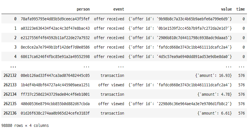
plt.figure(figsize=(8,6))
sns.countplot(data= temp_df, x="event",palette="Set2", hue = "time")
plt.show()

plt.figure(figsize=(8,6))
sns.countplot(data= temp_df, x="time", hue ="event",palette="Set2")
plt.show()


