Seaborn
Seaborn : Statistical Data Visualization library based on matplotlib.
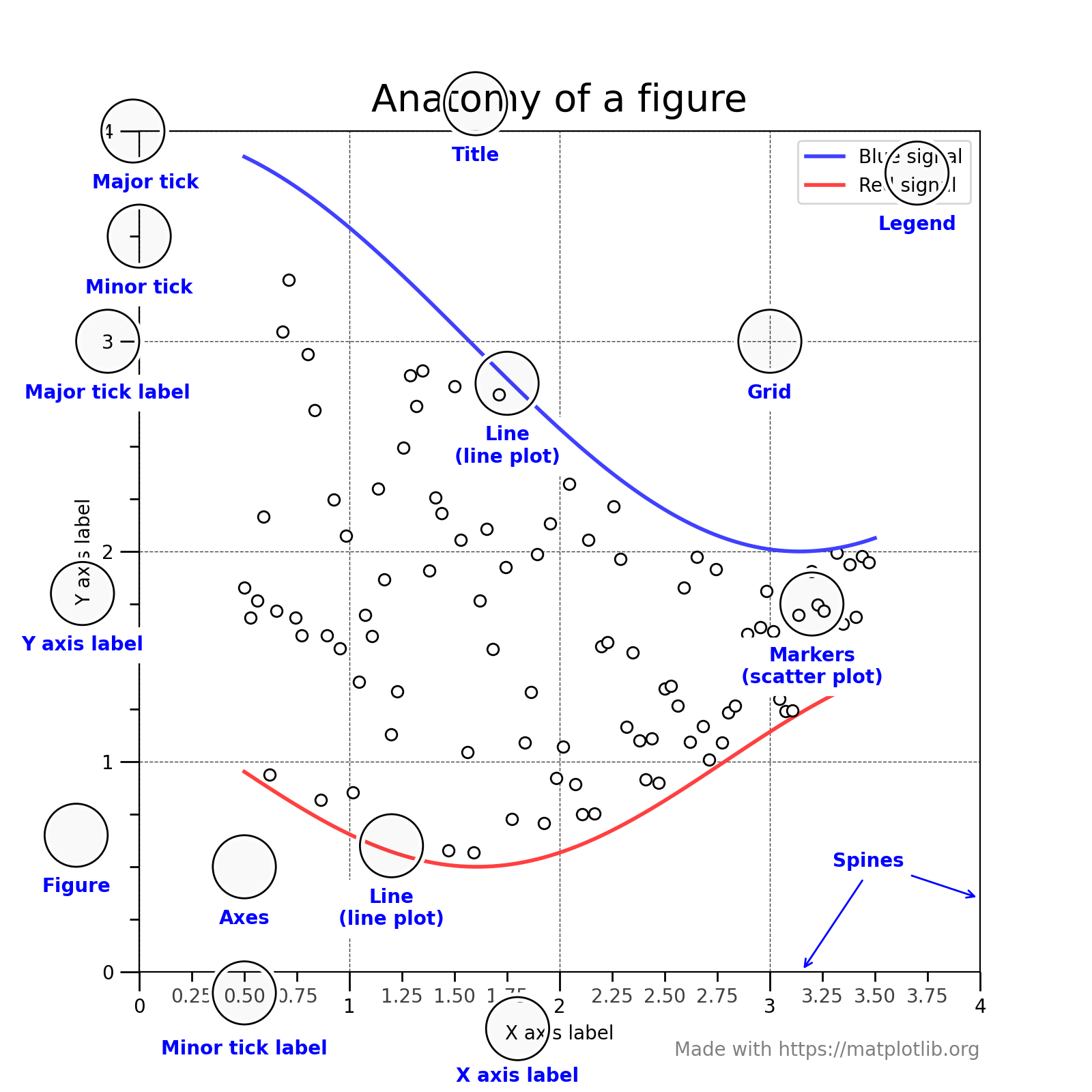
Matplotlib
- 파이썬 오픈소스 라이브러리 중에 가장 널리 사용되는 시각화 라이브러리이다.
- 2002년부터 만들어졌으며, MATLAB의 기능들을 파이썬으로 가져오는 컨셉으로 시작되었다.
- 각종 논문에서 figure를 그릴 때, 사용될 만큼 깔끔하게 그래프를 그려주는 것으로 유명하다.
- figure 라는 도화지에 여러가지 component를 얹어서 그래프를 완성하는 컨셉으로 구현된다.
- 크게 pyplot 을 이용하여 구현하는 방법과 OOP-style 를 이용하여 구현하는 두 가지 방법이 있다.
- 빠르게 적당한 퀄리티의 그래프를 그린다면 pyplot을,
- 디테일하게 이것저것 표현을 한다면 OOP-style로 구현하는 것을 추천한다.
Seaborn
https://seaborn.pydata.org/index.html
seaborn: statistical data visualization — seaborn 0.11.2 documentation
Seaborn is a Python data visualization library based on matplotlib. It provides a high-level interface for drawing attractive and informative statistical graphics. For a brief introduction to the ideas behind the library, you can read the introductory note
seaborn.pydata.org
- 2012년에 만들어졌으며, matplotlib을 더 편하게 사용할 수 있도록 만든 라이브러리이다.
- matplotlib이 MATLAB을 표방하여 디자인된 것과 다르게, seaborn은 numpy, pandas 같은
파이썬 라이브러리들을 편하게 시각화하는 것을 중점으로 디자인된 라이브러리이다. - 특히, DataFrame을 직접적으로 지원하기 때문에 훨씬 편리하게 데이터를 시각화할 수 있습니다.
- 그리고 matplotlib 위에 만들어져서, matplotlib에 있는 개념들을 확장해서 사용할 수 있습니다.
- 다양한 기본 plot들이 있어서 빠르게 통계 분석을 하기에 편리합니다. → EDA
몇 가지 기본 plots
1. Lineplot
https://seaborn.pydata.org/examples/errorband_lineplots.html
Timeseries plot with error bands — seaborn 0.11.2 documentation
Timeseries plot with error bands seaborn components used: set_theme(), load_dataset(), lineplot() import seaborn as sns sns.set_theme(style="darkgrid") # Load an example dataset with long-form data fmri = sns.load_dataset("fmri") # Plot the responses for d
seaborn.pydata.org
import seaborn as sns
sns.set_theme(style="darkgrid")

# Load an example dataset with long-form data
fmri = sns.load_dataset("fmri")

# Plot the responses for different events and regions
sns.lineplot(x="timepoint", y="signal",
             hue="region", style="event",
             data=fmri)
2. boxplot
https://seaborn.pydata.org/examples/grouped_boxplot.html
Grouped boxplots — seaborn 0.11.2 documentation
Grouped boxplots seaborn components used: set_theme(), load_dataset(), boxplot(), despine() import seaborn as sns sns.set_theme(style="ticks", palette="pastel") # Load the example tips dataset tips = sns.load_dataset("tips") # Draw a nested boxplot to show
seaborn.pydata.org
import seaborn as sns
sns.set_theme(style="ticks", palette="pastel")

# Load the example tips dataset
tips = sns.load_dataset("tips")

# Draw a nested boxplot to show bills by day and time
sns.boxplot(x="day", y="total_bill",
            hue="smoker", palette=["m", "g"],
            data=tips)
sns.despine(offset=10, trim=True)
3. Jointplot
https://seaborn.pydata.org/examples/joint_kde.html
Joint kernel density estimate — seaborn 0.11.2 documentation
Joint kernel density estimate seaborn components used: set_theme(), load_dataset(), jointplot() import seaborn as sns sns.set_theme(style="ticks") # Load the penguins dataset penguins = sns.load_dataset("penguins") # Show the joint distribution using kerne
seaborn.pydata.org
import seaborn as sns
sns.set_theme(style="ticks")

# Load the penguins dataset
penguins = sns.load_dataset("penguins")

# Show the joint distribution using kernel density estimation
g = sns.jointplot(
    data=penguins,
    x="bill_length_mm", y="bill_depth_mm", hue="species",
    kind="kde",
)
4. Pairplot
https://seaborn.pydata.org/examples/scatterplot_matrix.html
Scatterplot Matrix — seaborn 0.11.2 documentation
Scatterplot Matrix seaborn components used: set_theme(), load_dataset(), pairplot() import seaborn as sns sns.set_theme(style="ticks") df = sns.load_dataset("penguins") sns.pairplot(df, hue="species")
seaborn.pydata.org
import seaborn as sns
sns.set_theme(style="ticks")

df = sns.load_dataset("penguins")
sns.pairplot(df, hue="species")'Python > Data Analysis Library' 카테고리의 다른 글
| Part03 Chapter.02 데이터 분석 라이브러리 09. seaborn plots (실습) (0) | 2022.07.24 |
|---|---|
| Part03 Chapter.02 데이터 분석 라이브러리 08 pyplot 기초 (실습) (0) | 2022.07.24 |
| Part03 Chapter.02 데이터 분석 라이브러리 06. Pandas method (실습) (0) | 2022.07.18 |
| Part03 Chapter.02 데이터 분석 라이브러리 05. Pandas DataFrame (0) | 2022.07.18 |
| Part03 Chapter.02 데이터 분석 라이브러리 04. Pandas를 사용하는 이유 (0) | 2022.07.18 |


